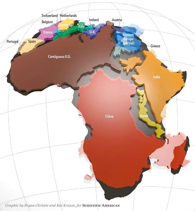
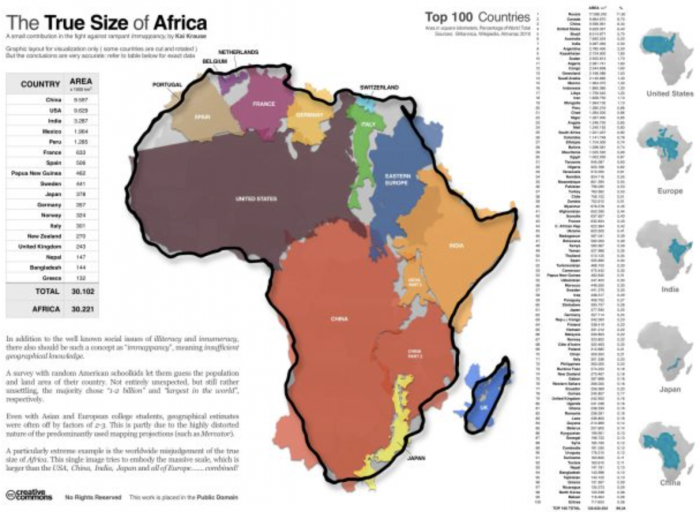
The actual size of the African continent:
She talks about why the map we all know is…racist, here:
Back when I had a longterm girlfriend, back before Elephant was a web site reaching millions of readers, back even before Elephant was a new little magazine, back before I became a workaholic, she had a strange-looking map on the wall. “The normal map makes third world countries look puny. This is what the world actually looks like,” she explained. I never got used to it. But it did shake, and stir, any notion that I knew what our planet actually looks like.
So:
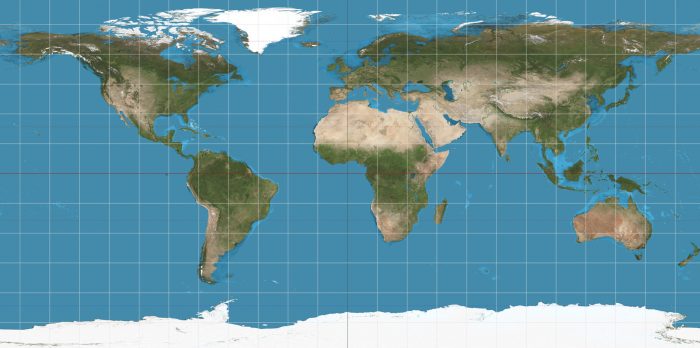
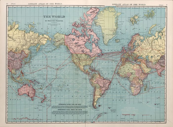
This is what we think the world looks like (Mercator map):
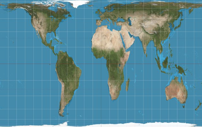
This is closer to what the world actually looks like (The Peters Projection):
I mean, check this out:
Bonus, via West Wing:




Read 42 comments and reply