

This is what we want, according to Google.
This map of the world will probably make you chuckle and then cry.
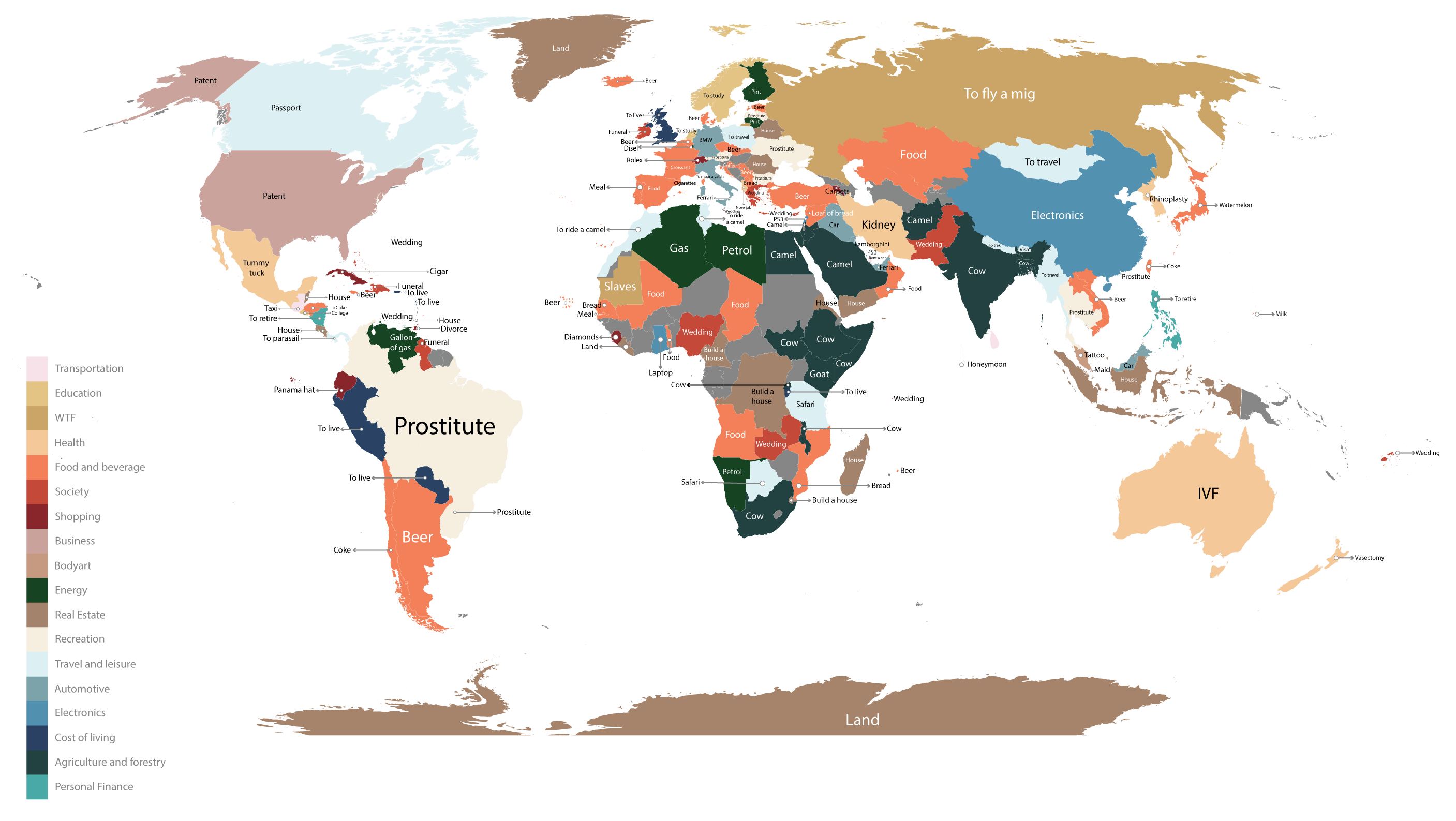
Recently compiled by U.S. company Fixr, the infographic displays the top searches on Google for “How much does a _______ cost in (insert country here)?” according to autocomplete. Of course, as data comes from Google.com, results might vary somewhat on Google.au or Google.ca, for example.
Though some of the top results make me laugh—e.g. “How much does it cost to fly a mig in Russia?” and “How much does a panama hat cost in Ecuador?”—most of them just make me really sad.
If this map is even the slightest bit representative, we (people using Google) are preoccupied with all the wrong things.
Prostitutes in Brazil, Ukraine, Hong Kong and Latvia. Slaves in Mauritania, diamonds in Sierra Leone and coke in Honduras. We also want to buy (or simply know the cost of) camels and cows, goats and beer—and, naturally, weddings and funerals.
We are curious what kidneys might cost in Iran or a Ferrari in U.A.E. We might want a tummy tuck in Mexico and rhinoplasty in South Korea. Ouch.
Taken as a whole, this map is probably a fairly accurate portrayal of our interests and desires and that’s pretty bleak. Take a look and see if you agree.
Which results make you laugh? Which ones make you cry?
(Double-click above for a larger version of the map.)
Relephant Read:
A Map of What Every Single Country Leads the World In.
You’re not truly spiritual unless you do this:
~
Author: Toby Israel
Editor: Ashleigh Hitchcock

Read 11 comments and reply